It’s always a pleasure to get the mail from Rouleur asking if I want to contribute to an article. I’ve done illustration work for them for quite a few years now, they seem to like what I do, I know what they might like, and as they aren’t afraid to be a little bit out-there when it comes to content it allows a broad brush of creative freedom. I always say yes; it is on the enjoyable end of the work spectrum and it’s led to some of my most rewarding work.
The role of the illustrator is essentially to pretty up the pages and offer breathing gaps in the walls of text to ease the reading experience and within that structure images can be used purely decoratively, add extra light and shade to the words or enhance their meaning. When the article arrives there’s no knowing which of these ways things might pan out.
Pedro Horrillo’s word were immediately so personal, powerful and emotional that a less-is-more approach was definitely required so as not to detract from their impact, it also helped that a large amount of the article’s context referred to emptiness and space dictating a minimalist style. Ideas came relatively quickly with only the opening illustration taking its sweet but stressful time to eventually and gloriously reveal itself.
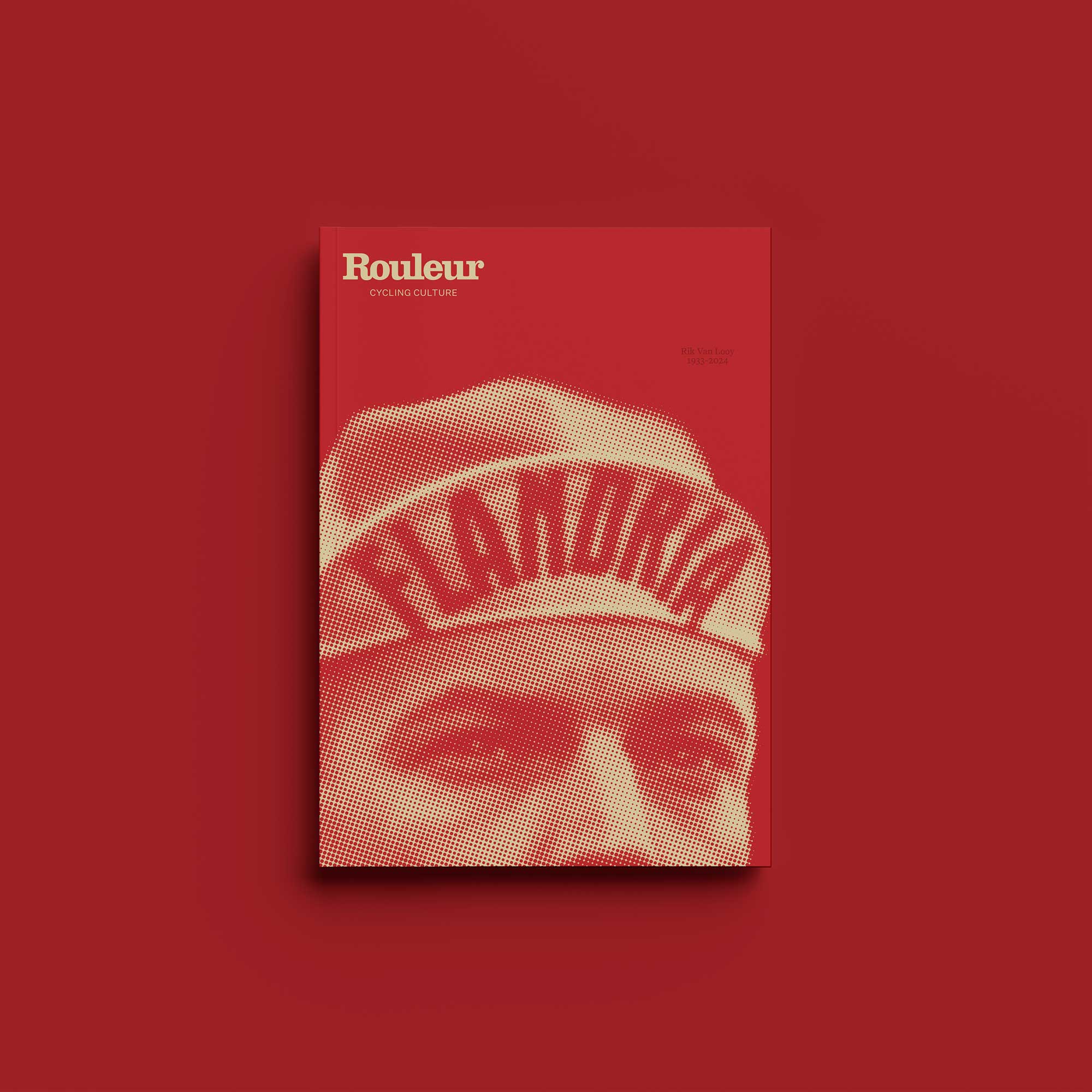
The usual to-and-fro with the editorial department led to the unexpected bonus of adapting one of the illustrations into the cover for the members issue. No matter how much illustration work you’ve done over the years, and for whom, it’s always a great privilege and accolade (and no small mark of faith in your work) to snaffle a cover.
Then just a lot of graft with a collection of pencils to get things done. Working for days – and then some – slowly creeping pieces of heavyweight paper from white to ever darkening greys and blacks. It’s fulfilling by slow, scratchy degrees.
It’s rare to get much feedback from submitted work. A “thank you” is sometimes too much even, but when the authur of the article responds that the illustrations have exceeded their hopes, have captured the depth of the essence of the text and given the article an unusual power, then that’s significant, touching and memorable. Especially for an article such as this. Knowing that I’ve contributed to something very special is why I’ll keep saying yes.
What’s in Rouleur 19.3?

It’s Giro joy with our Italy special. We’re in the mountains with favourite Simon Yates, the attacking and ambitious climber seeking greatness.
We go inside the corsa rosa: Giuseppe Saronni recalls his 1979 victory, we see the creation of the Trofeo Senza Fine, look at the punchy Bologna prologue and interview all-Italian champion Elisa Longo Borghini.
Matt Rendell explores the transforming nation behind the Tour Colombia; there’s the story of Gios’ orange years and part two of our pro cycling concussion discussion. Plus Pedro Horrillo on his life-transforming Giro crash, Desire, Boulting, Bardet, York and more…

The post Cover Stories: issue 19.3 by Jo Burt appeared first on The world's finest cycling magazine.


