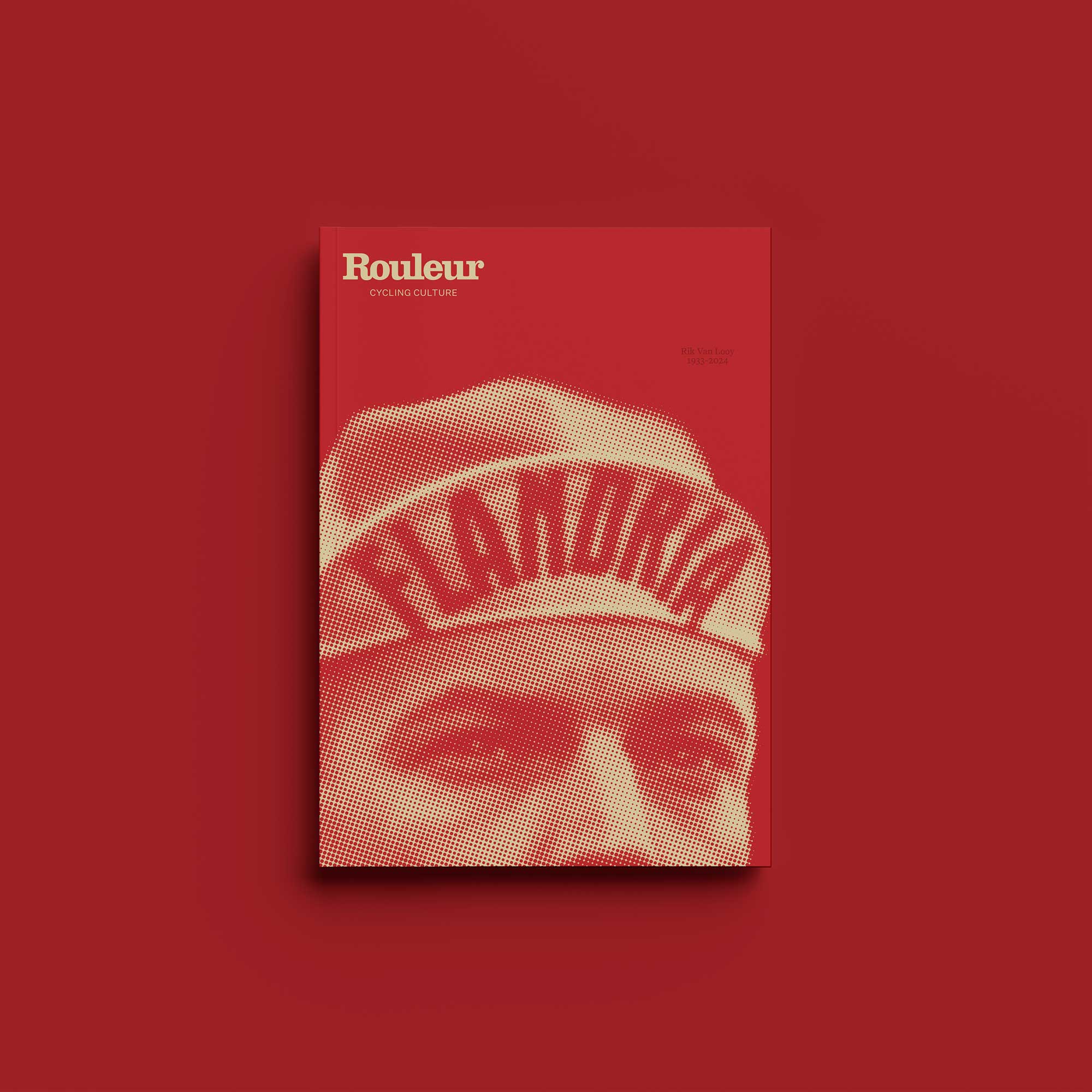
We have a special cover story for you this month, in celebration of a ground-breaking edition of Rouleur – our 100 per cent women’s content issue, with unique and compelling features celebrating women on two wheels from around the globe, with guest editor Orla Chennaoui at the helm.
Getting the cover right was even more important than usual. So here we share our thought processes from the very early stages of mood boards and mock ups right through to the amazing finished article, which got the seal of approval from Orla.
Creative director Jeremy Kunze is your guide, with Enric Adell, designer for our Spanish edition Volata, weighing in potential cover ideas across the Rouleur portfolio – now available in English, Italian and Spanish.
Buy Rouleur women's special issue now
 “The first time all three teams have sat down and discussed the cover. These were early concepts by Enric before we had the images of Shanaze who was to be our main story. The idea was to convey a collective to spread across the covers of all three editions. We liked it as a group shot rather than an individual but on its own, I didn’t feel it conveyed the message strongly enough.”
 “Again, the idea here was to get three riders and have them illustrated by three different artists – again, a nice concept and we are not ruling it for future issues.” (Illustrators: Left to Right: Mercedes de Bellard, Sibusiso Mlombo, Galina Gubchenko)

“This was more conceptual. Enric’s early concept here was to suggest that women’s cycling was still a ‘work in progress’. It’s a nice idea but we felt it was something that had been done before.”
“This was getting more interesting and it led to how we approached the images of Shanaze. I’m not sure about the pigtail, but it was a starting point.”

“I think Andy [McGrath] came up with this idea of togetherness, companionship. It feels like a Rouleur cover, but it could also be an advert for Canyon, which I wanted to avoid.” (Photo by Thomas Maheux)

“It’s a great image and there’s that notion that professional athletes work incredibly hard, particularly women and the challenges they face, but I felt it focussed too much on one woman. We also didn’t want to just replicate what was inside the magazine already. There were already enough cycling images inside. And again, it felt like it could be an ad for Canyon or Rapha.” (Photo by Sean Robinson, Vélofocus)

“This is when we received the images of the main story of Shanaze Reade, photographed by Véronique Rolland. They were incredibly powerful and basically summed up everything we’d been discussing. That said, it again focused only on Shanaze, which is when we had the idea of using a crop of her mouth. Inside were all stories by women and a mouth represents how those stories are told. Incidentally this full image is used on page 1 with a quote by Shanaze: ‘A bike’s a bike. Just get on it and rip it.’”

“I had lots of thoughts about ‘shouldn’t we just put a woman on a bike’ as the cover, but when I looked back into the archives of Rouleur's early covers, it’s not something that Rouleur does. I felt that the most striking covers were ones which didn’t show cycling at all. They jumped out to me as they made you think, debate, dream, challenge, and that’s what a cover of Rouleur should do and hopefully will continue to do.”


